AI · Marketplace · Live product
Mira
Find secondhand, fairly.
A chat assistant that searches resale sites, checks if a price is fair, and shows listings in the thread. I audited the live product, then redesigned and shipped the UI.
Overview
From audit to a clearer product.
Mira is for buying secondhand without opening ten tabs. The live product had gotten messy, so I audited it, listed what was broken, redesigned the flows in Figma, then built them. Navigation, onboarding and filters were rebuilt around how people actually search.
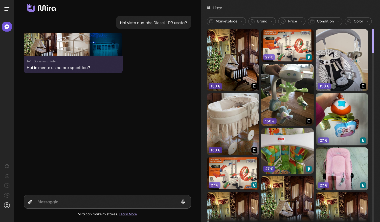 After
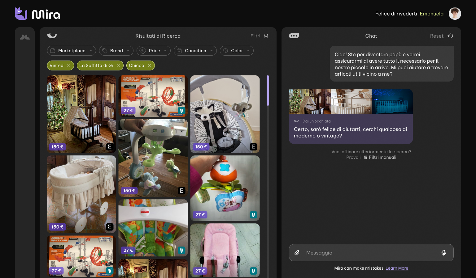 Before
Platform audit
What the old experience got wrong.
I mapped usability issues on the live product in Figma before designing replacements. Callouts sit on the UI on wide screens. On mobile, tap a number to read one note at a time.
Desktop · onboarding
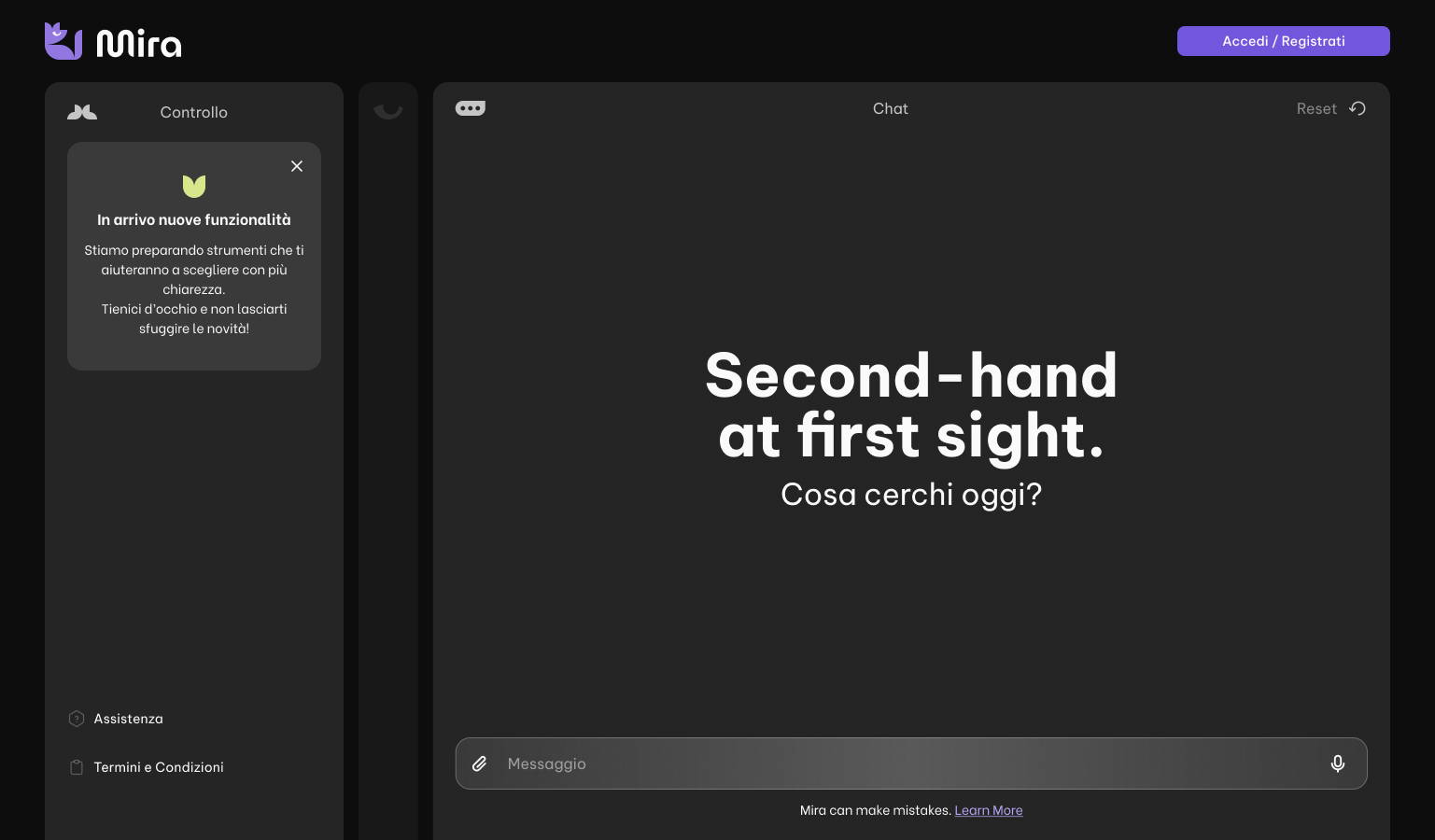
Chat on the right and canvas on the left is unusual. Canvas usually sits on the right.
Cognitive overload.
Hard to decipher why one panel is darker grey.
Desktop · logged in
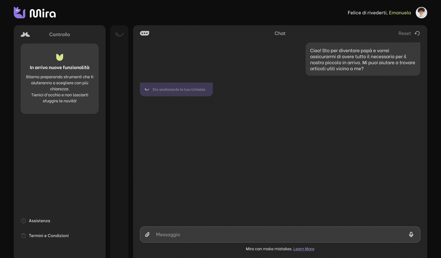
A lot of unused space in the header.
The split is unclear. Centre-aligned text is hard to read, and the copy runs on too long.
Mobile · onboarding
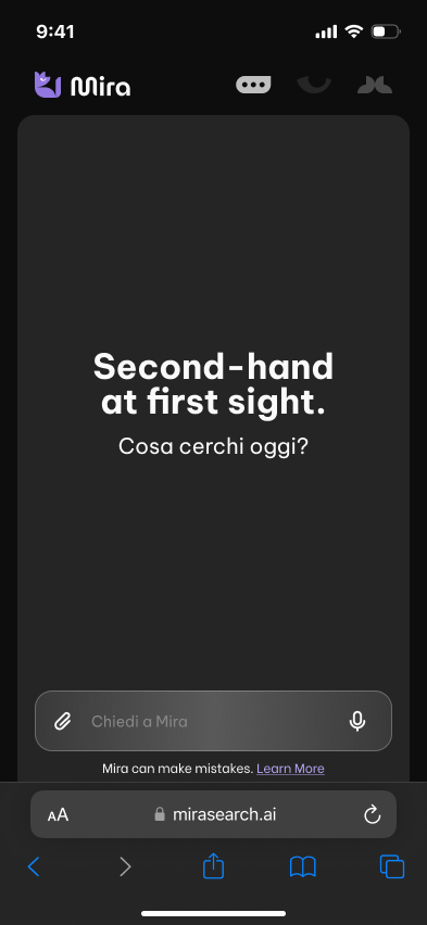
These icons look like view toggles but they open app sections. They are also all visible before anyone has searched.
Overall lack of user engagement on the landing screen.
The headline does not tell you what to search for first.
The input has poor contrast, a weak tap target, and too many things crammed into one bar.
Mobile · waiting for reply
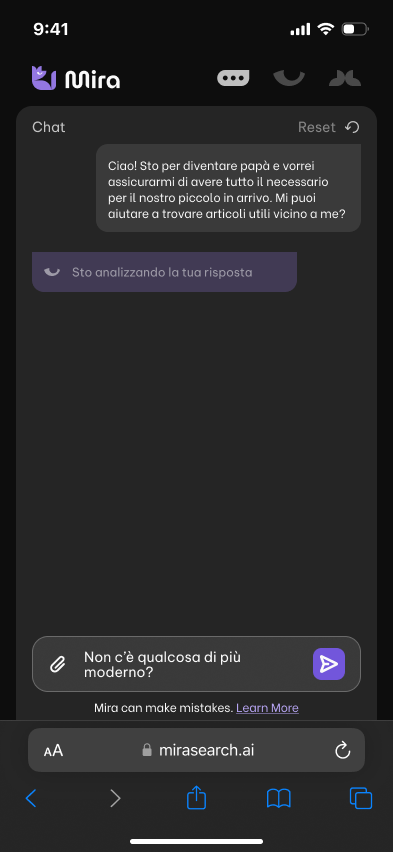
The status bar fights the dark chrome. Hard to read against the system UI.
Mobile · chat
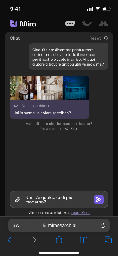
Filters are easy to miss: long copy, a tiny Filtri link, and nothing stays put while you scroll.
Refining a search means leaving the conversation.
Mobile · results
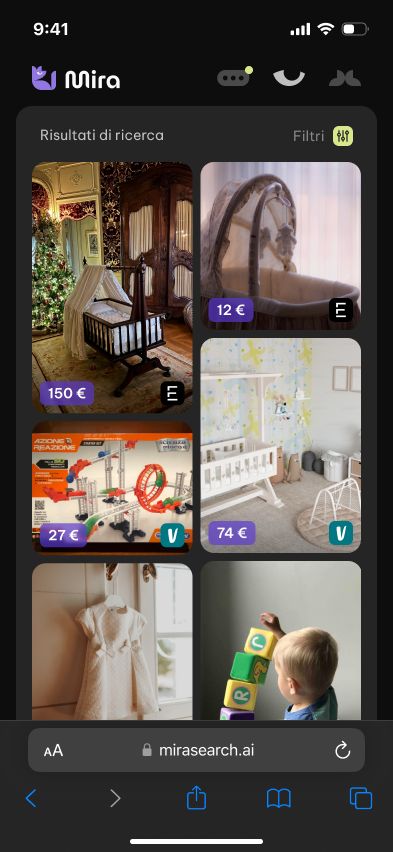
Filtri jumps to a different place than it had in chat.
Mobile-first redesign
One thumb, two modes.
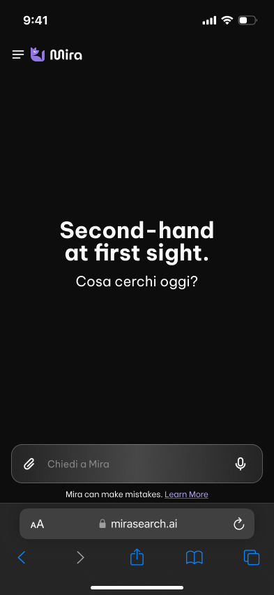
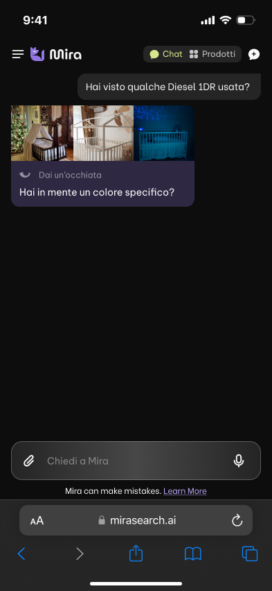
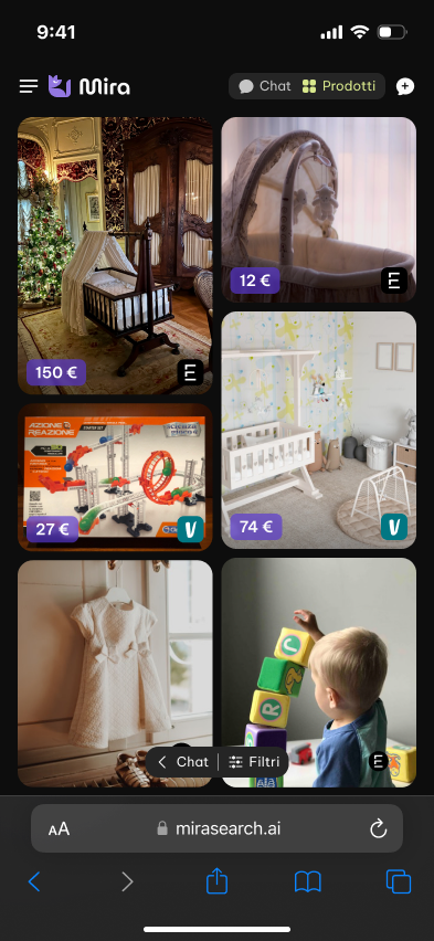
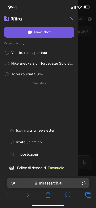
Mobile was the hardest surface: the old layout tried to squeeze a desktop split onto a narrow screen. The redesign gives Chat and Prodotti equal weight in the header, and only reveals controls when they're relevant.
After the first prompt, a new-chat button shows up. When listings arrive, a header toggle switches between the conversation and a Pinterest-style grid. Empty screens stay empty. No mystery icons.
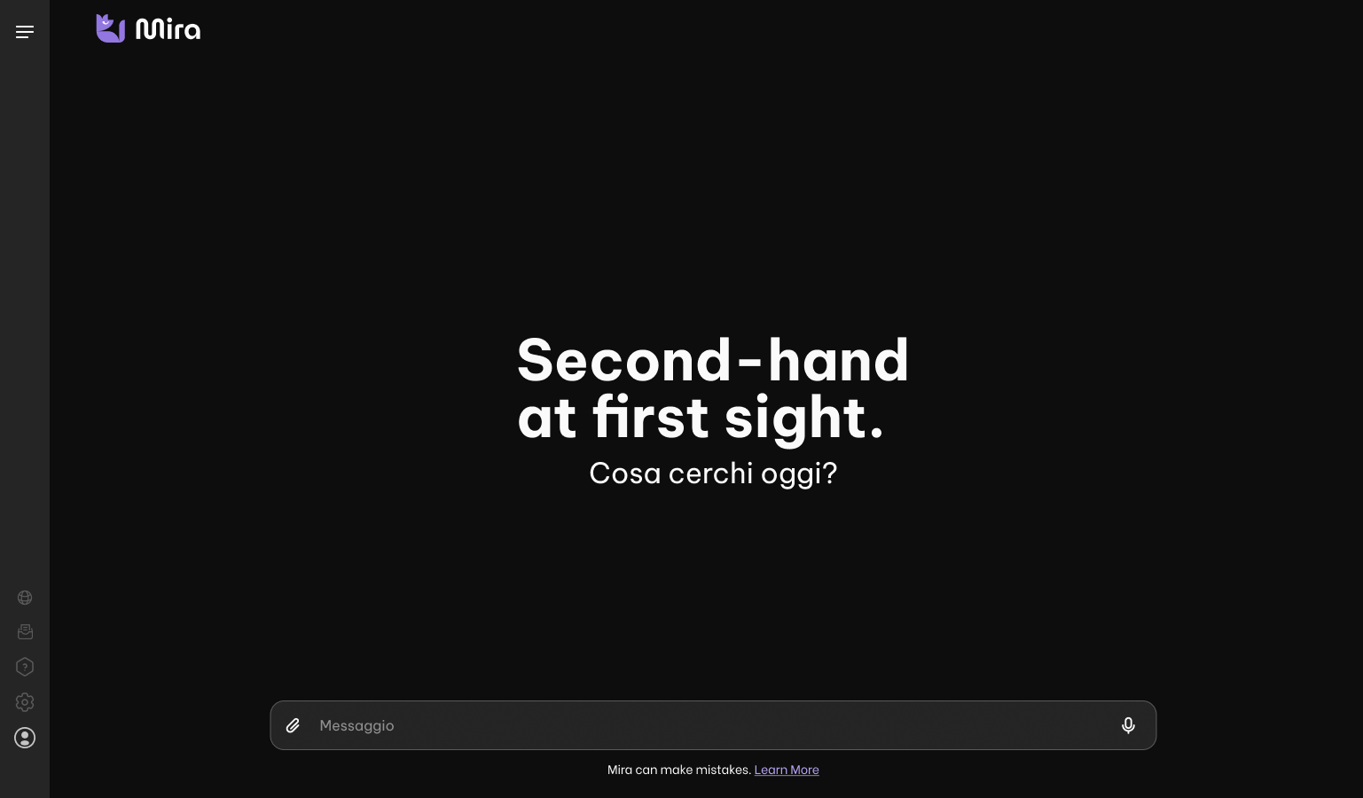
Desktop redesign
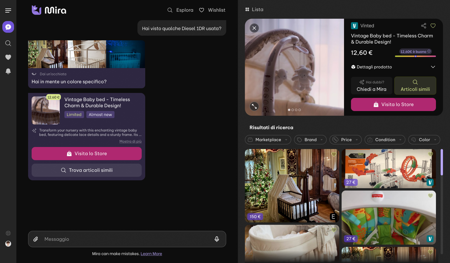
A slim nav, chat-first layout.
Navigation is a slim icon rail. Conversation sits in the middle. Lista and Controllo open as side panels when you need them, not before.
What makes it work
Judgement, built into the interface.
Fair-price meter
A gradient gauge rates every listing against comparable sales.
Cross-marketplace
One search covers resale sites. Each result is badged with where it came from.
Inline previews
Matching listings show up as cards in the thread, so you can compare without leaving chat.
Ask Mira anything
“Chiedi a Mira” turns any product into a plain-language conversation.
Reflection
Audit first, then ship.
Buying secondhand is a pile of small calls: is it real, is the price fair, is it worth the hassle? Writing down what the old product got wrong made the redesign easier to defend. Starting on mobile meant desktop did not inherit the same mess.
Not everything worked first time. People didn't get Explore at launch and went straight to chat. An affordance animation later got about 10% of visitors to try it at least once.